Story of BeePass Branding
Let’s make this VPN more lively.
How did the story of branding our first VPN (Virtual Private Network) start? ASL19, a technology and media organization working on helping people access information, launched BeePass VPN in early 2021 to help people in Iran — where voices and content are frequently censored by the state — to bypass internet censorship and improve online privacy.
Before we start, we want to thank and give credit to the Jigsaw team at Google for their work on Outline, an open source project that allows users to create, run and access their own VPN servers. BeePass VPN is an adaptation of Outline, a version carefully designed for our target users. Because of this, branding became an especially important step of our work on BeePass VPN in order to establish the application’s own look and feel.
In this blog post, we will provide some snapshots of how we came up with our branding strategy step by step. Here are the stories behind BeePass VPN’s brand personality, naming, user research, logo design, and our beloved mascot, Biz Biz.
Defining brand personality
Before we even came up with a name for the product, we already started defining a “brand personality” — attributes that would attract our target users. As a team, we made a list of what we wanted our product to be and not to be.
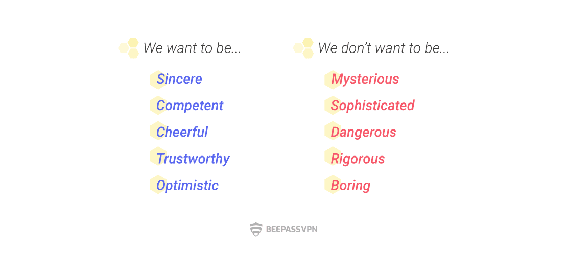
We decided that the product (branding) should be cheerful and trustworthy, while at the same time secure and optimistic. From this exercise, we defined two major personality traits for the VPN, “Sincerity” and “Competence.”
Story behind the name
Following the brand personality exercise, we started a rigorous process to find a suitable product name. To make sure we include a diversity of perspectives, members across design, marketing and outreach teams came together with ASL19’ directors to contribute their ideas. A lot of them were considered before we landed on “BeePass”: Pigeon, BlueShell, Narwhal, VPNLy, WePass, Upath, and many more!
When the word “bee” came up, we immediately thought of network, communication, distribution and the essential role of bees in our world. It was a perfect match with what we want to do: to fight against censorship by distributing secure servers; to fulfil the essential needs of people; to have an open internet.
User research
User feedback and insights have played a great role in creating the product, from development to branding. A key factor in human-centred design is to empathize with users and understand their essential needs. Thanks to our past projects, we have a good level of knowledge about our target users who struggle with censored and blocked content, slow internet connection and occasionally internet shutdowns. But this time, we needed to particularly understand how they use and think about VPNs.
Through surveys and user feedback, we found that our users in Iran had very different perceptions of VPNs compared to users in countries that enjoy freedom of press and expression. For the latter, using VPNs is mostly for one’s privacy and security online or perhaps to stream Netflix in a different region. For people in Iran, however, VPNs and proxies are an essential part of their daily lives if they want to use twitter or connect with friends and families via Telegram, the most popular messaging app in Iran. Seeing a “blocked” notice on your browser and having to use VPNs on a daily basis to access websites or apps that are supposed to be open are not pleasant. When we put together a user persona in this case, it was important that we considered emotions such as frustration, exhaustion, anger, and worry.
Another essential need of our target users is the product’s reliability and security. Unfortunately, there are a lot of unreliable VPNs out there that can truly put one’s digital security at risk.
Logo design
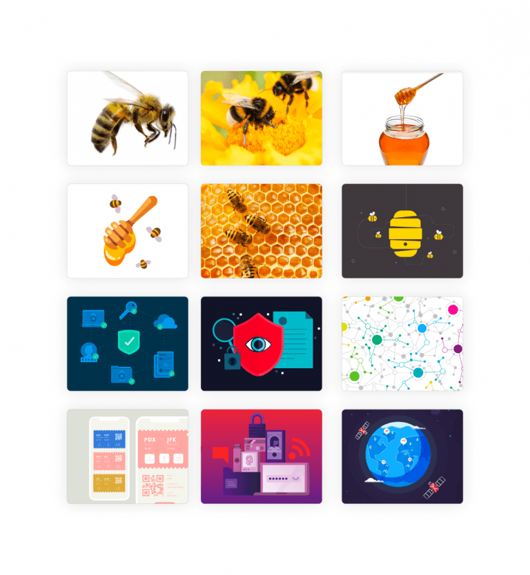
After the brand personality exercise, product naming and user research comes logo design. At this stage, we had to come up with ideas, inspiration, colors and shape preferences.
Color preference
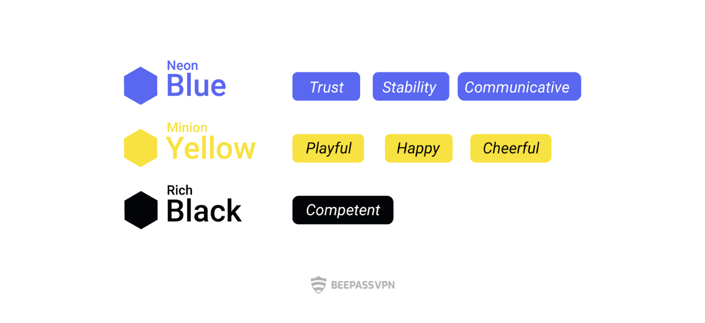
The imagery of bees played an essential role in our branding. Luckily, the bee colour palette is closely aligned with our brand personality. In psychology, yellow is often associated with the idea of playfulness, happiness and cheerfulness, while black could represent competence. We also included the colour blue to add the impressions of “trust,” “stability” and “communication” to the brand.
Shape preferences
Natural shapes generally convey stability, balance, and originality of the product. Later in the ideation phase, we tried to come up with natural shapes that could represent the brand name BeePass.
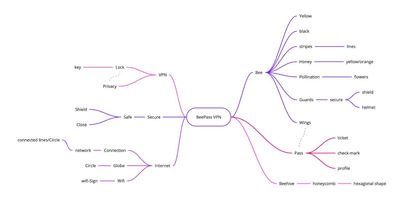
Inspiration
Mind Map graphs are great tools for brainstorming and coming up with related keywords based on a central theme. Using “BeePass VPN” as the central theme, here we came up with as many related keywords as we could on the mind map:
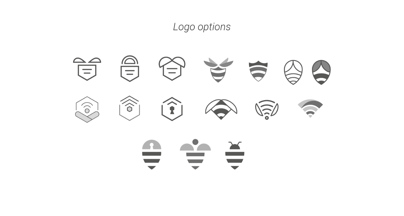
Idea generation
We usually start with sketching some ideas and putting them on a wall (or a virtual wall for better collaboration under COVID) to get feedback from the team. Once we select a few candidates, we create their monochrome digital versions.
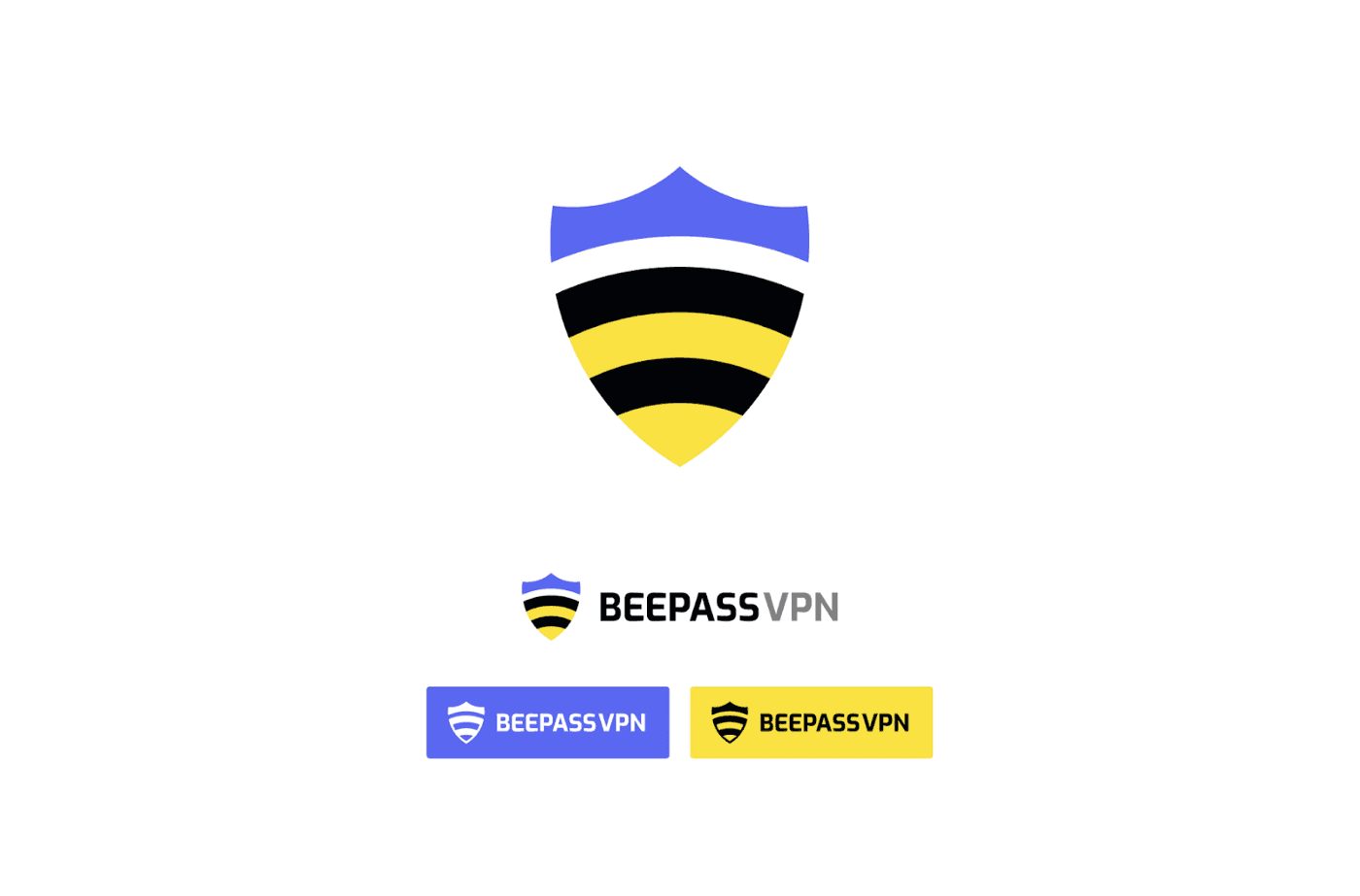
Finalize the design
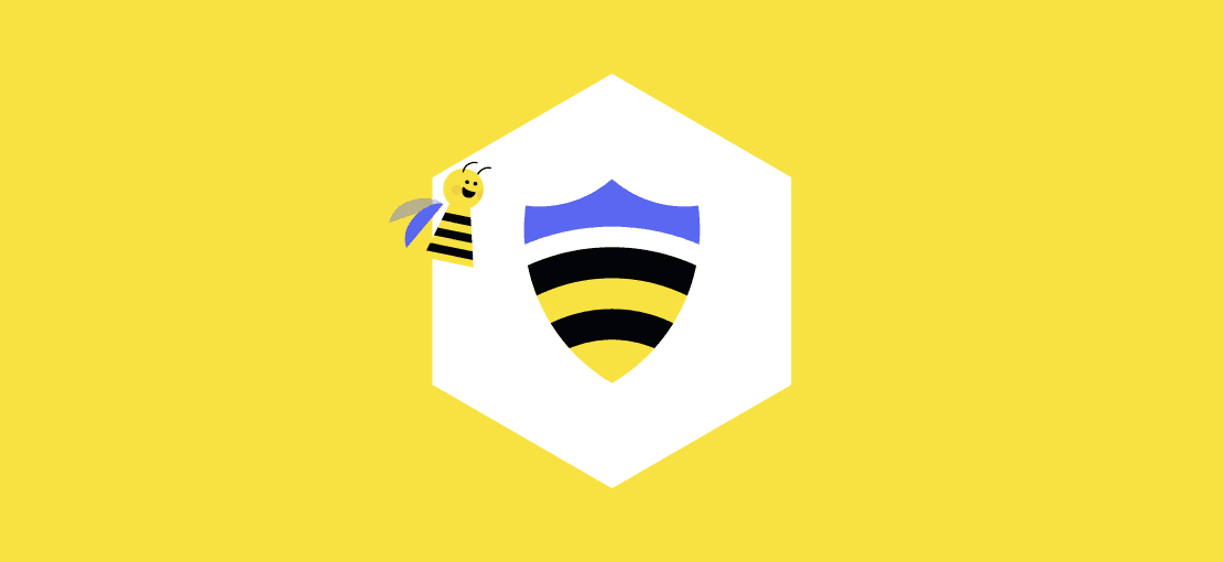
After a few iterations, we tried various colours and typography to get to the final design. Our logo consists of symbols from a bee and a shield to represent our name and the security focus of the app. The vibrant colours of yellow and blue reflect the cheerfulness and trustworthiness of our product personality.
Mascot
As for the mascot, what’s better than… a bee? To really bring out our product personality, we decided on a cute, playful and cartoony style. While creating different bee characters, we also played with the idea of a villain character and some additional elements.
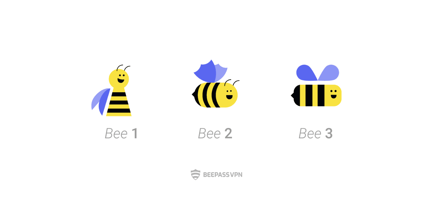
At the end, we had a finalized mascot design and named it “BizBiz”
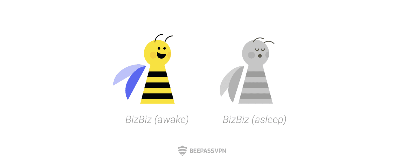
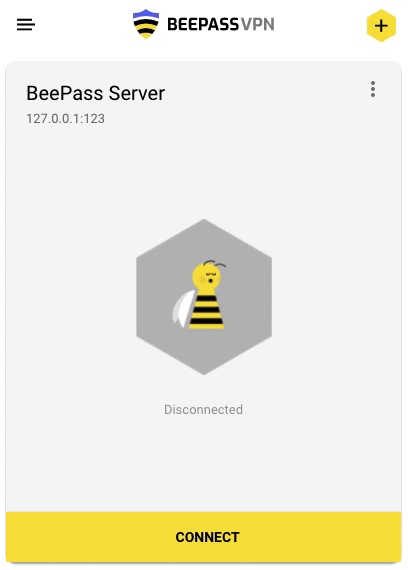
The mascot is also used in our product design to give it a more cheerful and playful look and feel. This is what it looks like when a user connects to a server:
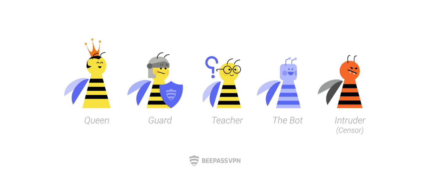
Just like a real beehive, we developed a few different characters and roles to expand our storytelling. For example, a bee guard character represents the app’s security, and an intruder bee represents the villain (or a censor) in our brand story.
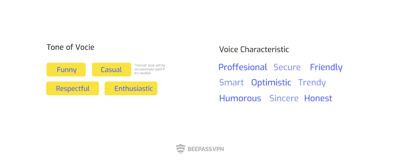
Tone of voice
Beyond just visual designs, it’s also important to match the tone of the product with the brand personality. Working with our outreach and marketing team, we decided on the brand’s tone of voice and its characteristics that would be applied to all of our promotional campaigns and written descriptions for app stores.
Final note
It’s been 4 months since we launched BeePassVPN on Google play (iOS version coming soon!)
Having a cheerful and friendly branding helps us build trust and engage with users more easily. As of June 24, 2021, we’ve had more than 15K installs on Google Play with around 7K daily active users, and our BeePass Telegram Channel has gained almost 4K subscribers. Biz Biz also plays an essential role in our social media storytelling to engage users and welcome their feedback.
For a project like BeePass VPN, a branding strategy is much more than simply making a product visually appealing to users. At the end, it is to ensure that the brand sends a message consistent with the product’s core value and how we do human-centered design: It’s all about sincerity and listening carefully to users’ needs.
🐝 BiizBiiz